Donation platform
A wholesale redesign to bring joy and clarity and fully realise the learnings from CRO
2025
Background
We’d learned a lot from our conversion optimisation work about how our donation journey was perceived and interacted with.
While conversion had steadily improved, design and technical debt had built up, and further iteration couldn’t give us the solid foundations needed for future growth.
Building on our CRO learnings and usability tests, and utilising our SightKit design system, I rebuilt the platform.
A challenge inherent in iterating by A/B test is maintaining a view of the whole, and envisioning future states and combined outcomes of successful tests.
It was easy to over-index when designing a new component, producing something too visually ‘loud’ or that took up too much space. With every piece of the puzzle shouting for attention it would not be possible to create a hierarchy of information.
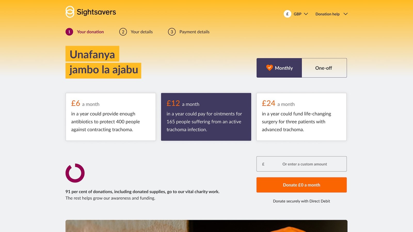
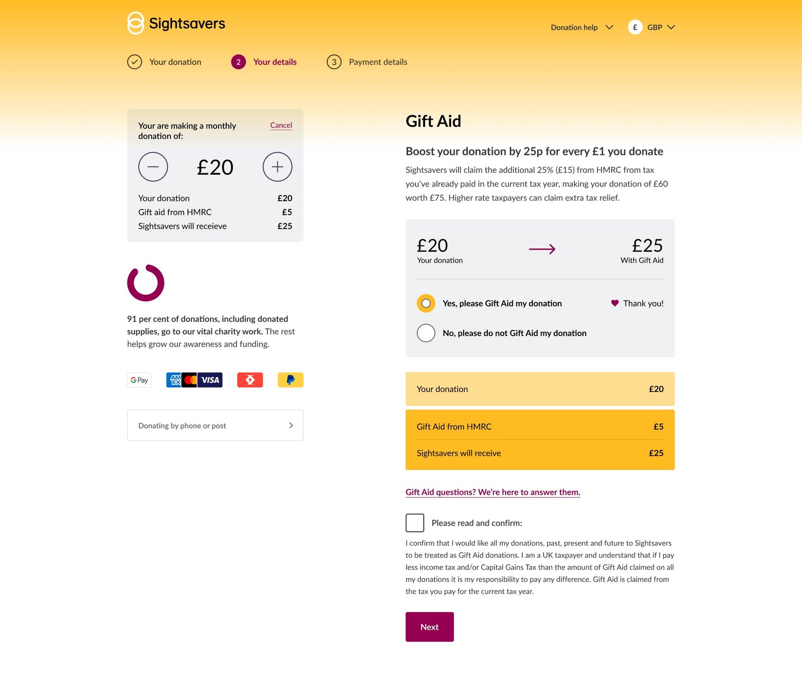
A wholesale redesign allowed me to carefully balance each unit of information. In a user interface every piece of text, every button, every icon is information that a user needs to make sense of, and this can add up quickly.
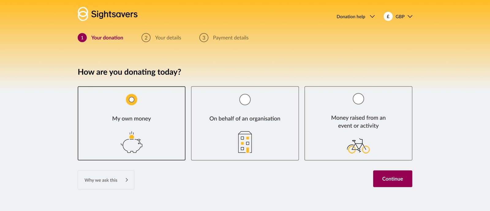
While it’s important to satisfy internal measures of success, good UX always has to answer to the user. We were doing ourselves and our users a disservice with our apologetic marketing communications and using soft opt-in over enthusiastic informed consent. I believed our supporter email was something to be proud of and so dedicated it a full screens worth of space since these ‘benefits’ can take time to expound.
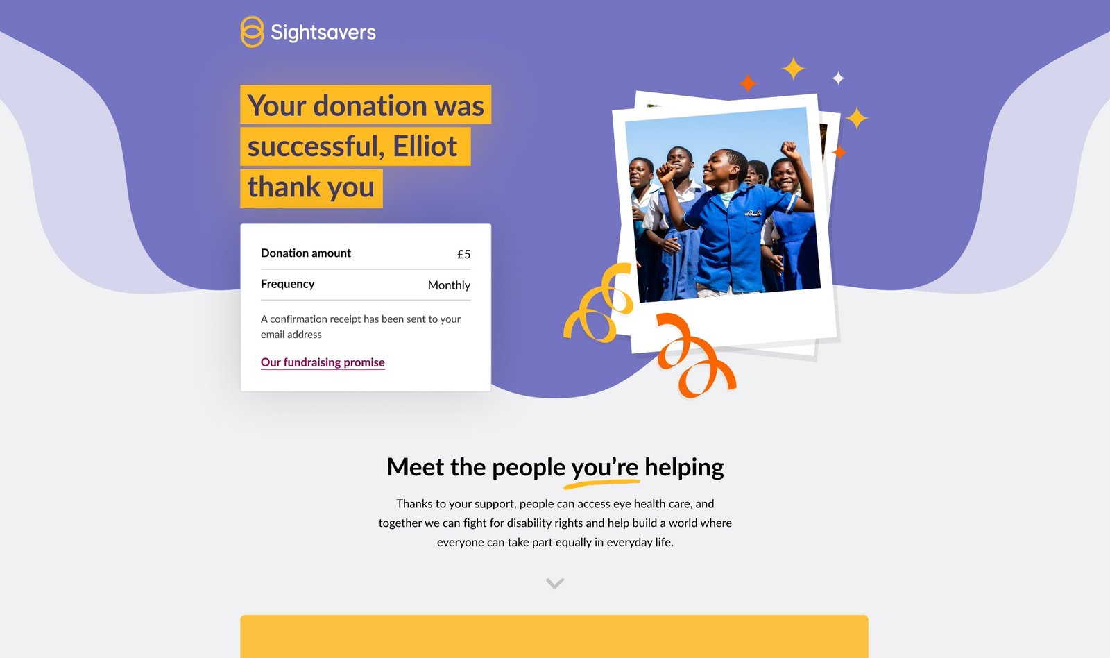
Finally, and perhaps the most needing of transformation, was our thank you page. Cold and transactional, the page elicited visible disappointment and underwhelm during user testing and a missed opportunity in terms of channeling the motivation of a recent donor. I began the page with an immediate sense of celebration and positivity followed by content reinforcing collective impact.
With thanks and credit to digital fundraising colleagues.
Learn more about the SightKit design system